TideBit DeFi
From zero to launch:
Building a crypto trading platform people can actually use.
Simplify the complex crypto trading experience with an intuitive and approachable interface
1 Year (From 0 to MVP & launch)
Lead Product Designer: Jodie Wu (Me)
Product Manager: Luphia Chang
Developers: Shirley Chang, Emily Liang, Julian Hsu
Web - SaaS (Responsive)

Overview
TideBit DeFi was just an idea when I joined the team, a vision of a crypto trading product using CFD (Contract for Difference) to offer an investment model different from traditional exchanges.
While DeFi (decentralized finance) is powerful, it's also intimidating. TideBit DeFi set out with one question: How do we make decentralized finance usable both for experts, and new comers?
Exploring the problem
Since I was new to crypto products, my first step was to immerse myself as a user. I learned the fundamentals of blockchain from our engineers, experimented with trading on multiple crypto platforms, and observed real user behavior by joining crypto communities. This helped me understand what users typically value and struggle with.
Once I built a solid foundation, I moved on to structured research. I conducted 10+ user interviews, collected 100+ survey responses, and completed 5+ competitor analyses to systematically identify key pain points and unmet needs.
User Interviews
To understand user needs, I conducted multiple user interviews which revealed two key groups: Newcomers who found DeFi and blockchain intimidating and hard to learn, as well as experienced traders who needed fast, clear data to act quickly. I found that new users were overwhelmed by complex terms and feared making mistakes, while traders wanted speed and precision.
This led to three design priorities:
-
Simplify and guide new users
-
Make investing feel easy and engaging, like a game
-
Streamline the experience for power users with fast, focused UI
Competitor Analyses
I analyzed five leading cryptocurrency platforms, including both DeFi (dYdX, GMX, Uniswap) and CeFi (Binance, Huobi), to identify common UX issues and opportunities. While my primary focus was on DeFi design, studying established CeFi leaders provided critical insights into the broader ecosystem and user expectations. Across these platforms, interfaces were often overly wordy, which made navigation difficult, and many suffered from poor mobile experiences due to complex charts and dense layouts. In addition, lengthy registration processes created unnecessary friction at the very beginning of the user journey.
Based on these findings, Tidebit-DeFi’s UX improvements focused on using clear and concise language, optimizing mobile experiences with simplified visuals, and streamlining onboarding to provide faster, more seamless access for users.
Survey
I conducted a survey using Google Forms and shared it across several crypto communities, collecting a total of 138 responses. The results revealed a key insight: around 81% of respondents were interested in learning more about crypto knowledge and news, but struggled to find accessible educational resources. Many felt that researching and learning on their own required too much time and effort.
This insight uncovered a major opportunity for TideBit to create a more user-friendly, education-driven platform where users can conveniently access curated information, learn step-by-step, and stay motivated with small rewards for interactions designed to keep users engaged.
Understanding the Users
After gathering insights from interviews, surveys, and competitor research, I translated the data into tangible user stories by defining personas and mapping their journey.These tools helped me understand who we were designing for, what they were trying to achieve, and where the major breakdowns occurred in their journey.
User Personas
I created two different key groups of Personas based on interviews

User Journey Map
I created a map of the User Journey — not just of platform usage, but starting from the moment users feel curious about crypto

What I Found
The #1 problem in blockchain products is user abandonment as a result of...
Excessive jargon and new terminology
Blockchain products often introduce many unfamiliar, technical terms. For most beginners, this creates confusion and reduces their confidence in using the product.
Complex and unfamiliar concepts
Blockchain is still a relatively new field. Behind the interface lies a set of complicated, abstract rules. Users are usually required to spend significant time self-learning before they can even start using the product.
Overwhelming features in most platforms
While most crypto investment platforms provide diverse investment methods and advanced features, this abundance can overwhelm new users. Instead of encouraging them to explore, it often makes them hesitant to invest money at all.
Defining the Goal
I sought to create a blockchain investment product that beginners are willing to stay with, not run away from
How?
Speak their language
Use plain, familiar language and provide contextual guidance to help users understand blockchain concepts without leaving the app to research.
Reduce friction
Break down dense, word-heavy screens into smaller, digestible sections so users only see the information they need at the right moment.
Build confidence
Design interactions that minimize errors, highlight key actions clearly, and give feedback to reassure users when they make decisions.
Make learning feel rewarding
Turn education into a fun, goal-driven experience with progress-tracking and rewards
Key Solution
With the design direction set, we were ready to bring this vision to life.
Use Human Language, Not Jargon
Problem:
New traders don’t understand “long”, “short”, or CFD mechanics
Solution:
-
Buttons say “Up” and “Down” instead of “long/short” so that when users are making decisions, they only need to think about "Do I think the price would go up or down and place order intuitively.
-
Real-time calculation shows users the point of where would they start making profit so that they don't need to do the math by themselves.
→ No need for users to decode financial logic, just make a choice and understand the outcome
Progressive Disclosure
Problem:
Most Crypto platforms have many different advanced trading features which may not be a good fit for every user, leading to a wordy, frustrating experience.
Solution:
-
Hide advanced feature like TP/SL with a toggle button, so that users only need to turn it on when they really need it.


Visualize Complex Information
Problem:
Users don’t know how to track the success of their positions.
Solution:
After opening a position, the system draws visual thresholds directly on the candlestick chart, so it clearly shows: “To profit, the price must cross this line.”
Positions can be closed with a single click.
→ Faster reaction, clearer thinking, more control
Make Trading Feel Like Playing a Game
Trading is normally stressful, but we:
-
Turned charts into interactive game boards
-
Added leaderboards, badges, and achievements
-
Encouraged “leveling up” your investment strategy
→ Users stayed longer, got emotionally engaged, and had fun learning

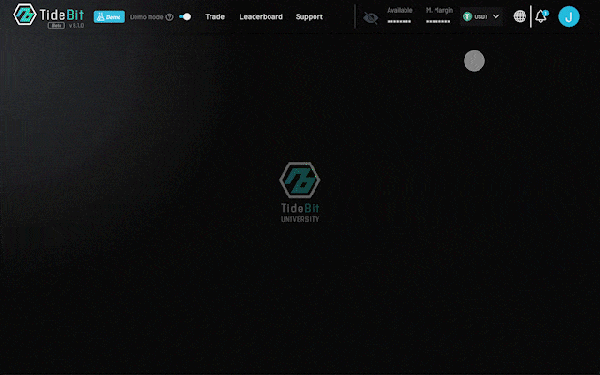
TideBit University
Problem:
Users don’t know what their position means post-trade
Solution:
-
The all-in-one learning hub within the platform: TideBit University
-
Users learn via videos + interactive lessons
-
Completion gives positive feedback, rewards, & builds achievement streaks
→ No more scattered searching; structured lessons guide users from novice to confident, step by step.
Demo Mode
Problem:
Users were hesitant to submit personal KYC documents for a high-risk product they didn't understand, leading to loss of users before their first trade.
Solution:
We introduced a risk-free Demo Mode that grants immediate access to virtual currency trading right after sign-up. This allows users to explore the entire platform, practice trading, and experience success without any fear of losing real money.
→ We transformed KYC from a barrier of trust into a gateway to opportunity, significantly increasing the development of educated and confident users.

Design Process
In the following sections, I'll break down how I designed the system and developed this solution from initial concept to the final design.
Function Map
To define the product ecosystem and ensure every needs are included, I created a function map to visualize all features and their relationships. It also helped with communicating to the development team and make sure every function is technically workable.
I designed 6 key functions: Register/Login, Market Overview, CFD Trading, My Wallet, Leaderboard, and TideBit University.

User Flows
I focused on several critical user flows, Register/Login, Deposit, Withdrawals, and Trades. These flow charts allowed me to design a seamless experience from onboarding to success, with a focus on eliminating unnecessary steps.

Designing the Interface: From Sketch to Screen
With the architectural blueprint in place, I began giving form to the experience, iterating from broad concepts to pixel-perfect details.
Low-Fidelity Wireframes
I started with low-fidelity wireframes to rapidly test different layout concepts and information hierarchies. In this stage, I made sure all the functions were included and the flows were seamless. It also allowed me to communicate with our team and stakeholders to ensure all users' and businesses' needs were addressed.

High-Fidelity Wireframes
Beyond the interactive solutions, the final product is wrapped in a cohesive visual identity designed to build trust and engagement. This section showcases the overall aesthetic, key screens, and the design system that ties everything together.

Impact & Results
After launching the MVP, we tracked key metrics to validate our design decisions. The results demonstrated a significant shift in user experience.
Quantitative Validation
Total Users
387,578
Total Trading Volume
$ 373.2M
Demo Mode recovered KYC drop-off rate by
18%
Qualitative Validation
Competition drives engagement
In-house pilot program demonstrated that the leaderboards improved engagement, as users would check daily to see if they had out-competed other users.
Retrospective & Learnings
A look back at the challenges, insights, and growth that shaped this project—and me as a designer.
What Went Well
The Demo Mode was the most impactful decision we made. It reshaped the user's mindset, making KYC feel less like a mandatory check and more like a voluntary step toward greater opportunity. This demonstrated that lowering the psychological barrier to entry is more important than featuring every advanced function upfront.
Gamify to Engage
Making things feel like a game can help users feel less scared and more interested. The small rewards, badges, and achievements encourage users to engage with the platform.
What I'd Do Differently
If I could revisit one thing, it would be to advocate for a more scalable design system from day one. Once our MVP launched and more designers joined the team, it became harder and harder to manage components and maintain consistency.