BAIFA Design System
33 components
100+ Variants
1000+ Variables
A scalable, accessible design system built to bring consistency and efficiency to BAIFA, a complex blockchain explorer.
1 Month
Lead Designer & System Architect: Jodie Wu (Me)

Design Principles
These three principles serve as the foundation of the BAIFA Design System, guiding our mission to transform complex data into clarity and trust.
Clarity is King
We combat data density with intentional breathing room. Ample whitespace and a clear visual hierarchy reduce cognitive load, allowing users to focus on insights without feeling overwhelmed.
Modular by Design
Every component is built as a modular building block. This ensures our system can adapt and scale to accommodate new features and complex user needs without compromising integrity.
Consistency Builds Confidence
Predictable patterns and reusable components create a reliable experience. When interactions feel familiar, users can navigate with confidence and trust the platform's output.
Foundation: Core Visual Elements
Just as a house requires a solid foundation before walls can be built, our design system begins with these core visual elements. They are the immutable building blocks, the colors, typography, icons, layout and elevation, that give every component its structure and voice, ensuring visual harmony and brand consistency from the ground up.
Colors
Our palette is designed to convey authority and provide clear, functional communication.
Brand Primary
Futuristic
The core brand color for key interactive components and navigation.
Brand Secondary
Technology/ Innovation
A decorative accent for visual enhancements and data visualization.
Neutral-Navy Blue
Stable/ Trust
Primary backgrounds, surface containers, and large field fills.
Neutral-Grey
Neutral
Border lines, disabled states, and secondary information.
Error
For errors and destructive actions that require immediate attention.
Warning
For cautionary states and potentially disruptive actions.
Success
To confirm positive outcomes and successful completion.
Typography - Poppins
A clear type hierarchy establishes reading order and scannability in data-dense interfaces. We chose Poppins for its geometric precision and excellent numeral legibility, which are critical qualities for displaying financial data and transaction details accurately. Its clean, modern personality aligns with our technological positioning while maintaining the approachability needed to simplify complex blockchain concepts. The font's extensive weight range provides the necessary expressive range for everything from data tables to interface labels, all while ensuring optimal readability across devices.

Icongraphic
We selected the Tabler Icons library for its clean, informative style that complements our system's visual language. Its simple outlines and rounded strokes create a modern aesthetic that maintains clarity at various sizes. With 4,000+ available icons, the library provides comprehensive coverage for all anticipated use cases while ensuring consistent visual weight across the interface.
Grid Systems
Our responsive grid is built on a foundational 4px unit, ensuring consistent vertical rhythm and visual alignment across all device breakpoints. Each layout specification, from column structures to gutter widths, is systematically scaled using this modular approach, creating a harmonious spatial system that adapts seamlessly from mobile to desktop environments.

Spacing
Our 12-point spacing system (4px–120px) creates consistent rhythm across the interface. Built on a 4px base unit, this modular scale provides the precise control needed to structure complex data layouts, ensuring balanced proportions and clear visual relationships between all elements.

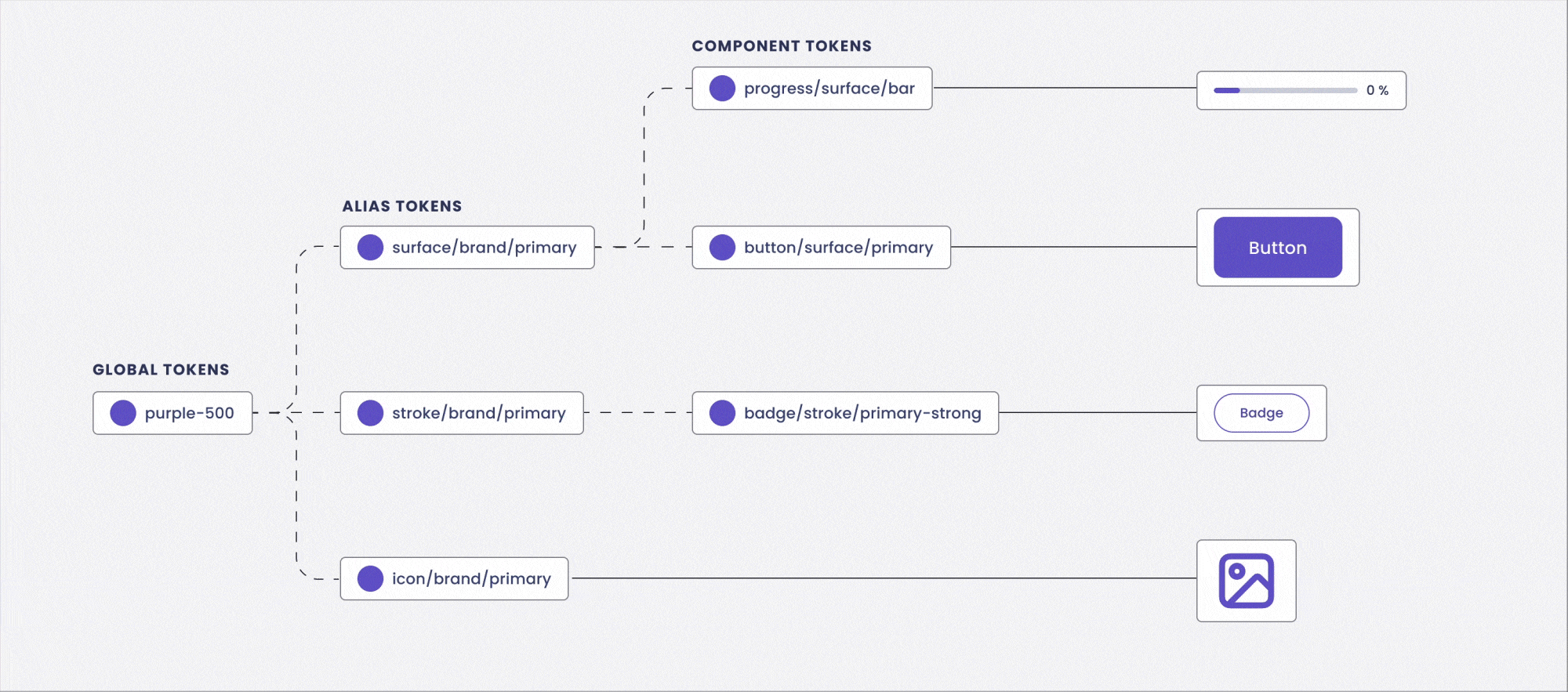
Structured with Design Tokens
I built a three-tier token system that separates raw values from their meaning and application. Global tokens define the core values like #purple-500. Alias tokens give them semantic purpose and enable themes, like mapping #surface-brand-primary to different purples for light and dark modes. Finally, component tokens bind these semantics to specific UI parts, such as #button-surface-primary-default. This structure ensures that a single change in a global token cascades correctly throughout the entire interface, enabling consistency, theming, and efficient maintenance.

Component Library
Our component library transforms design tokens into reusable, interactive building blocks. Each component is engineered with multiple states and clear usage guidelines, ensuring developers can build consistent interfaces faster while maintaining design integrity across the entire BAIFA platform.
Button
I designed buttons with clear visual hierarchy. Filled for main actions, Outline for alternatives, and Ghost for minimal interfaces. It also comes with a full set of states from hover to disabled. Each button supports optional icons on either side, letting it adapt to different contexts.

Alert (Toast)
I designed two layouts: a vertical stack for critical, action-driven messages that need focused attention, and a horizontal bar for passive, auto-dismissing notifications that sit subtly in the corner. Both styles cover success, warning, error, and info states, ensuring the right level of urgency without ever interrupting the flow.

Date Picker
I built the date picker around a clear visual calendar, organized into three tiers: date, month, and year. This lets users easily jump to distant dates without endless scrolling, keeping the interaction smooth whether they’re picking a single day or planning months ahead. The layout stays clean and intuitive, so selecting a date feels straightforward, not like a chore.

Text Field
It’s not just a blank box. I designed the text field to provide clear feedback at every step with distinct error and success states, helpful inline messaging, and smooth focus transitions. Whether it’s a simple login form or a complex data filter, this component maintains visual consistency and remains accessible across the entire platform.

Other Components: The Full Toolkit
Beyond these core pieces, the library includes a complete set of interface elements from navigation and modals to data tables and tooltips. Each is built on the same token-driven foundation, ensuring every part of the BAIFA platform feels cohesive, intentional, and easy to build with.

Impact & Reflection
A look at the tangible outcomes for the team and product, and the key lessons that shaped my growth as a designer.
Impact
Accelerated Development
According to the report from developers in our team, the design system reduced development time by an estimated 30%.
Reduced Maintenance Cost
Centralized styles and components, making global updates, such as brand color changes, instantaneous.
Enhanced Design Efficiency
Enabled designers to assemble high-fidelity mockups 50% faster using pre-built, approved components.
Key Learnings
Advocacy is Part of the Job
The hardest part wasn't designing the system, but championing its long-term value to stakeholders focused on short-term deliverables.
Naming is a Superpower
Creating a clear, intuitive naming convention for tokens and components is foundational to clear communication.
Empathy is for Engineers Too
The best system is one developers love to use. Involving them early ensured technical feasibility and buy-in.